
As it becomes easier to launch online stores, the ecommerce marketplace is becoming increasingly crowded. To keep up with the competition, ecommerce stores must make shopping an easy, seamless, and enjoyable experience.
According to the Wall Street Journal, for the first time ever, people bought more goods online than in brick-and-mortar stores in 2016. When United Parcel Service Inc. surveyed 5,000 shoppers, 51% purchased items online. It’s increased from 48% last year and 47% in 2014. In addition, 44% of smartphone users said they bought something on their phones this year, which is three percent higher than 2015.
These numbers are only going to increase. For this reason, online retailers have to create websites that are easy and enjoyable to browse. One of the core areas that most ecommerce stores ignore is improving category pages that list various products.
The following are steps to take to ensure that your ecommerce category pages are up to par and appealing to your customers.
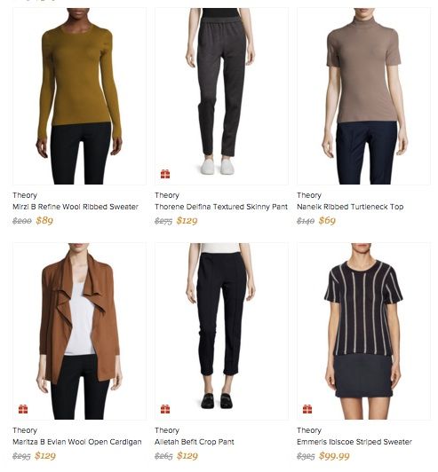
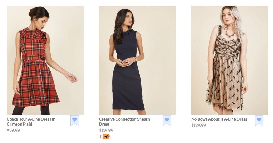
1. Keep Images Consistent
Your customers, especially those with small screens, need to be able to easily scroll through your merchandise. The images that convey the products should be consistent in style and size. According to BigCommerce, the boxes around your images should all be the same size, and your photos themselves should take up 80 to 90% of the box. They should all have a white background, which will guarantee that they look neat and clean.
In terms of style, you should determine the angle on which you’re going to showcase along with your photos. Will all of them allow customers to zoom? Will you have images displaying the products in action? It’s your decision; either way, as long as the functionality remains consistent.
If you run a clothing ecommerce store, you need to choose whether or not to show just the product, or the product on a body, or the product on a model with her face being shown. Gilt.com, for example, always demonstrates the clothes on models, but doesn’t show their faces. They’d rather focus more on the products themselves.
2. Make Searching Simple & Use Faceted Navigation
Customers can find nearly any product imaginable online and get it delivered to their home within the week. To compete with other stores, you’re going to have to enable customers to find exactly what they want on your website. This means that you should keep your search function specific and intuitive for your customers.
First, make your search box big, so customers can type in what they want and double check that their query is free of errors. As Econsultancy’s Graham Charlton points out, when searching for electronics, customers may input a long product code. If the box isn’t big enough, they won’t be able to make sure they got the code right. They may get frustrated and go to another site that allows them to do this.
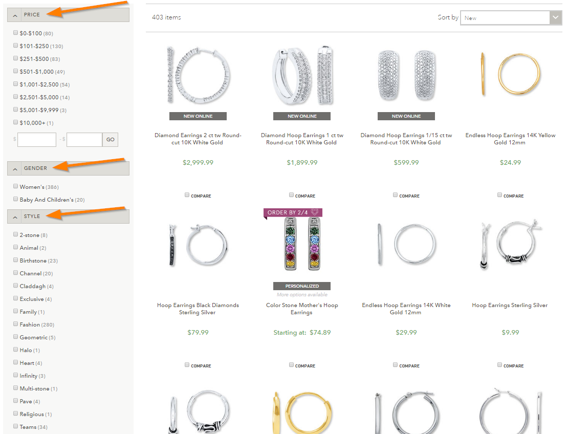
Customers should also be able to search within certain sections, and not get results from other category pages. For example, if customers are on the purses section of a clothing website, the search results should only display what’s on the purses page. Within these category pages, there should be options that get very specific and let customers search according to a number of factors. This type of search is called faceted navigation, and it gives the customer the chance to find exactly what he or she is seeking by product feature.
There are serious SEO implications for handling faceted navigation correctly, so make sure you’re up to speed on those best practices. Moz & Search Engine Land have good resources on the topic.
On Jared’s search page for hoop earrings, customers are able to search by price, best sellers, name, brand, how new the products are, whether they’re for kids or women, what style they are, if they can be personalized, the type of metal they’re made of, the stone type, and if they’re part of a collection through faceted navigation.
3. Break Up Pages By Different Shopping Criteria
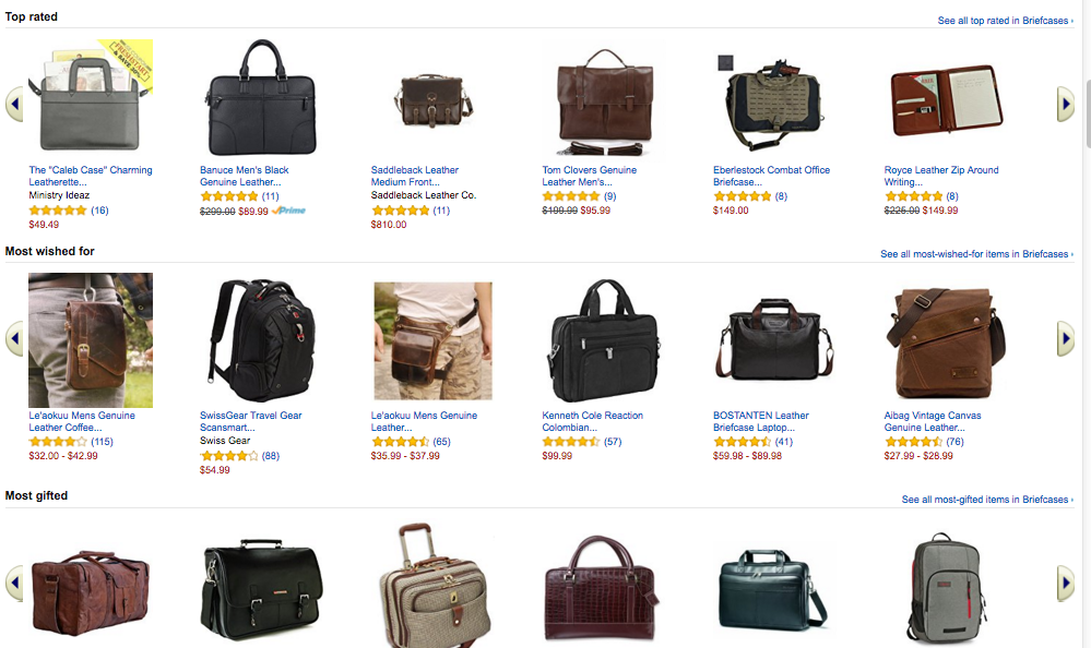
Customers don’t always know which product they’re hoping to purchase. They may need help choosing the best item possible. To assist them and act as a virtual shopping assistant, split up the page of search results with various shopping criteria.
For example, you could highlight the top-rated products, the best sellers, or those that are on sale. You can showcase what’s in limited stock or goods that have been featured in the media, perhaps.
Amazon.com breaks up its search results for briefcases by best sellers, hot new releases, top rated, most wished for, and most gifted. That way, consumers aren’t inundated with choices and can figure out the product that will fit their needs.
4. Highlight Special Offers
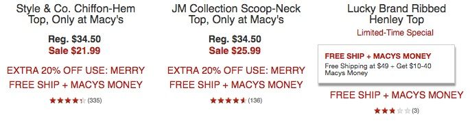
It always makes sense to entice customers with a great deal. If you’re offering free shipping for certain purchases, or items have gone on sale, include that information below the product image. You may even want to feature the original price and the sale price in a different color to make it apparent how much your customer will save.
On its product pages, Macys displays the original price, shows the sale price in red, and includes its offerings like free shipping, an extra 20% off, and/or Macys Money to encourage customers to add items to their carts. The following are from the women’s clothing part of the site.
5. Include Urgent Calls To Action
Want to create more demand for your products? Showcase their popularity by incorporating urgent calls to action on your category pages. This can mean stating that time is running out to get a great deal, writing that something is in “limited supply,” or that there are only a few products left. As long as you follow through with your urgent calls to action, customers will be more likely to purchase from you.
For example, ModCloth will tell their customers when they only have a certain number of products left available to buy.
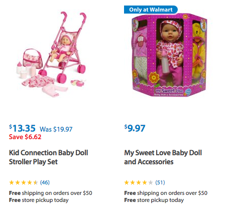
6. Show Icons That Denote Reviews
According to research by Pew Research Center, roughly eight-in-ten Americans (82%) say they consult online ratings and reviews when buying something for the first time. On your ecommerce category pages, you should feature product reviews as well.
These don’t need to be text-based. You can simply place stars or another icon that shows the popularity of a product beneath each of your images. By doing this, you’re helping customers make a decision about whether or not they want to buy.
For example, Walmart.com shows how many stars a product has, and lets customers rate them one through five. The site also displays how many customers have reviewed a product. This adds even more credibility and, if a product has a high number of stars from a large amount of customers, other shoppers will be more inclined to buy it.
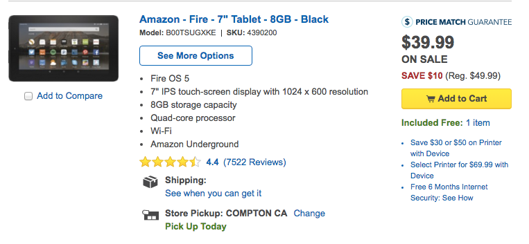
7. Allow Customers To Easily Add Items To Their Cart Or Wish List
Customers may want to shop on the go, or perhaps they’ve bought a product before, and already know they like it. Either way, they don’t have time to click through to a product page and read all about it.
Instead, make it simpler by allowing them to add a product to their cart or a wish list on your site with the click of a button. They’ll be able to check out quicker and have a smooth shopping experience on your site.
For some guidance, take a look at Best Buy’s website. Alongside every item, they let you hit “add to cart.”
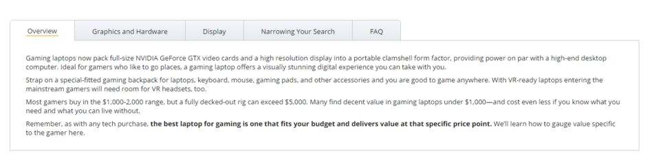
8. Add Custom Sales Copy
It’s essential that you add custom sales copy for SEO purposes. Category pages are often ideal for targeting specific keywords, however, they’re not full of unique content, which search engines like to see. An easy way to add this content is with a couple custom paragraphs of sales copy and content that helps shoppers with their decision making process.
Here’s an example from NewEgg.com’s page for Gaming Laptops. At the bottom of the page they provide some explanations on how to decide on product criteria and other helpful information. Is it primarily provided for SEO purposes? Perhaps – but it’s effective and useful content for users, too, which is essential.
Improving category pages is a crucial task for ecommerce companies. By ensuring that your ecommerce category pages are simple, clean, and easy to navigate, as well as include the right sales pitches, your customers will be glad to purchase from you.
✉️ Get an email when we publish new content:
Don't worry, we won't bug you with junk. Just great content marketing resources.

Ready To Try
Content Harmony?
Get your first 10 briefs for just $10
No trial limits or auto renewals. Just upgrade when you're ready.
You Might Also Like:
- Content Brief Templates: 20 Free Downloads & Examples
- The Keyword Difficulty Myth
- How To Find Bottom of Funnel (BoFU) Keywords That Convert
- Bottom of Funnel Content: What Is BOFU Content & 10 Great Examples
- 20 Content Refresh Case Studies & Examples: How Updating Content Can Lead to a Tidal Wave of Traffic 🌊
- How to Create Editorial Guidelines [With 9+ Examples]
- Content Marketing Roles
- How To Write SEO-Focused Content Briefs
- The Content Optimization Framework: [Intent > Topic > UX]
- How To Update & Refresh Old Website Content (And Why)
- 12 Content Marketing KPIs Worth Tracking (And 3 That Aren't)
- 16 Best Content Writing Tools in 2024 (Free & Paid)
- How to Create a Content Marketing Strategy [+ Free Template]
- How To Create Content Marketing Proposals That Land The Best Clients
- What Is A Content Brief (And Why Is It Important)?
- How To Create A Dynamite Editorial Calendar [+ Free Spreadsheet Template]
- How to Use Content Marketing to Improve Customer Retention
- Types of Content Hubs: 5 Approaches & 30+ Examples
- How To Do A Content Marketing Quick Wins Analysis
- There's A Better Way To Measure Keyword Difficulty