Fonts
We use large, bold Fira Sans for our headings.
We use standard weight Libre Baskerville for our body copy.
Colors
Our core design style is based around our primary blue (#0a56c7), white canvas, and dark gray text (#1F2937) or black text (#000000), all of which are focused on making our typography pop.
We use emojis, photography, and screenshots to liven up the colors on top of that.
Logo
The Content Harmony logo includes the wordmark, as well as our lotus logo.
Full Logo
We typically use the full lotus and wordmark for standard logo usage.


Lotus


Our Lotus can be used on its own in situations like avatars, favicons, or memo headers:
Logo Margins
Please use at least 1x height as standard margin on all sides of the logo.
Example: if logo height is 80px, then we should use standard of 80px margin on all 4 sides of the image.
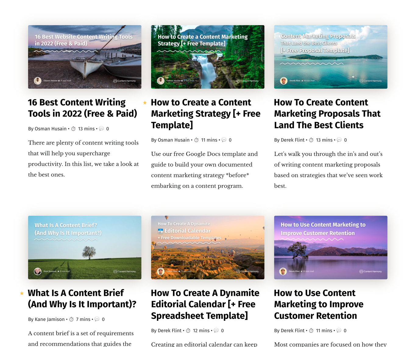
Photography
Throughout the site we use landscape photography for featured images. The goal is to give a sense of 'harmony' without looking like a yoga studio.
These appear on social media previews, Slack link share previews, and on index pages like www.contentharmony.com/blog/. They do not appear on the post itself.
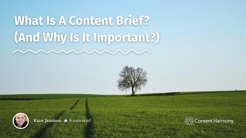
Approved Photography Examples
We specifically use clearly shot, natural-looking landscapes, sourced from Unsplash.
We don't mind images with dynamic color range like the purple example below, so long as the photo is clear and doesn't look like an Instagram filter.

Photos We Wouldn't Use
We avoid non-landscape phography, eg cityscapes, people, and prominent objects in the foreground.
We also avoid unnatural-looking edits to the photography like high contrast, blur, and other 'filter' types of effects.
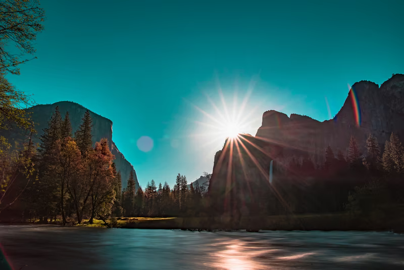

One exception to city photography is our case studies, where we may choose to use a skyline from the city that the customer is based in, or a shot from a park or natural setting inside that city.
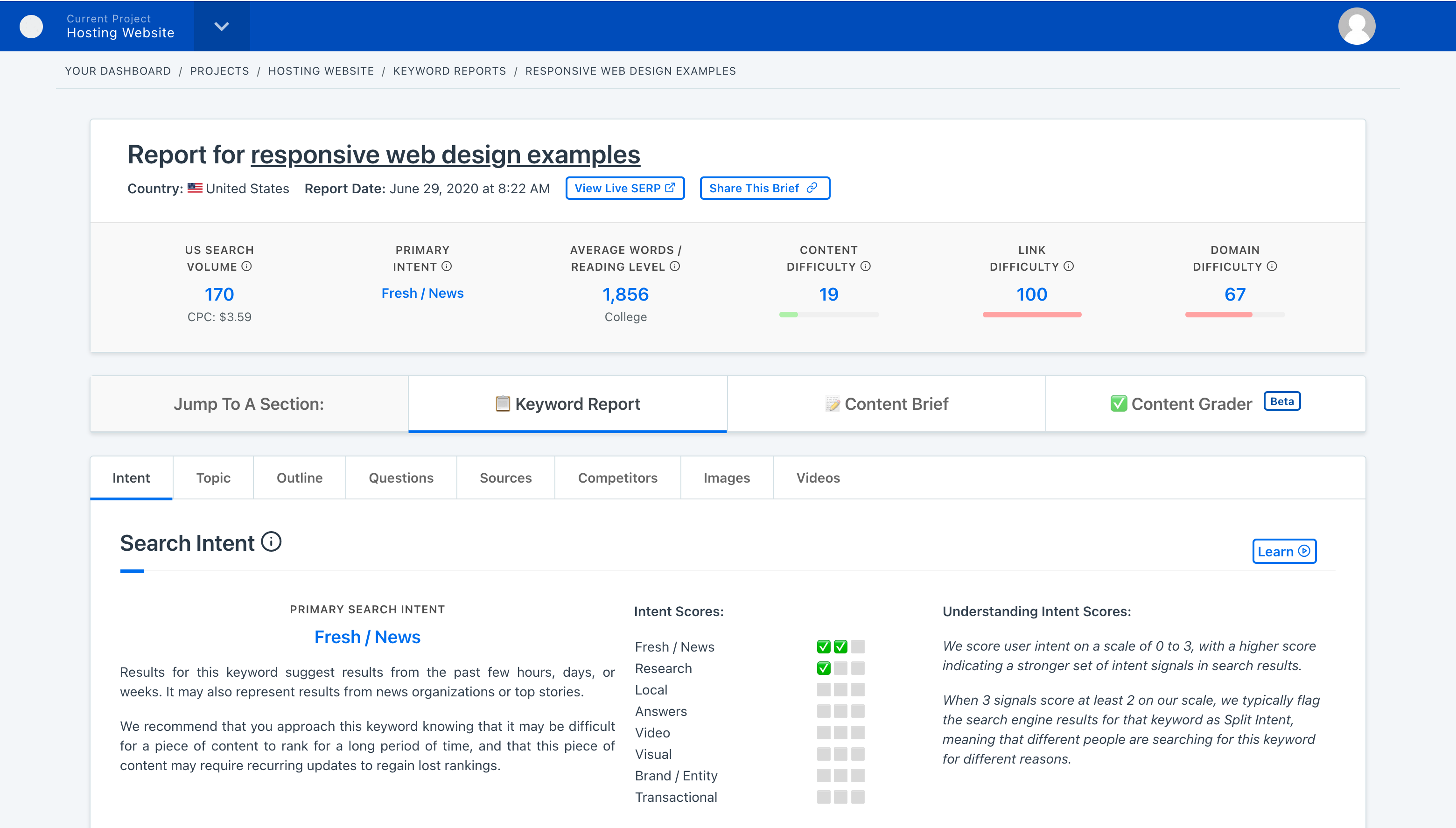
Screenshots & Other Graphics
We make extensive use of other graphics in our blog posts as well as landing pages.
By default, all photos will be formatted with a drop shadow and rounded corners, which helps make screenshots more visible when they have a white background.
When creating screenshots, there are a few ways you can make them more valuable for users:
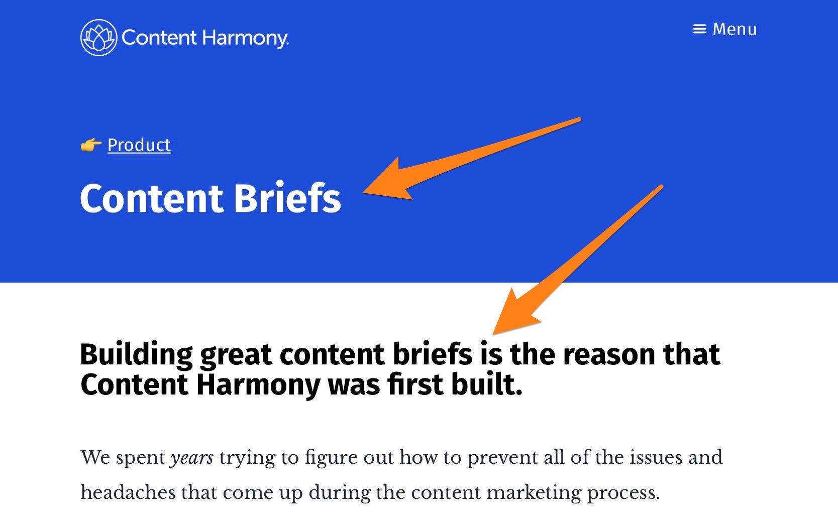
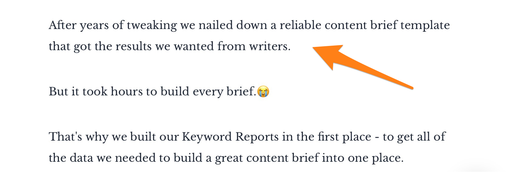
- Adding arrows or highlight boxes to quickly call attention to the area of focus.
- Screenshotting enough area to give the user context on what they're looking at, but screenshotting close enough to the subject matter so the user doesn't have to pinch zoom if they're reading on mobile.


Jump to a Brand Guidelines Section: Philosophy | Voice & Tone | Editorial Guidelines | Our Audience | Word List | Visual Guidelines | Web Elements