
Brand integrity is a fragile thing, so it needs to be treated as such. Brand guidelines are, in essence, your owner’s manual on how to “use” your brand. These guidelines will be referenced by everyone who touches your brand, internally or externally, and will often be partially reused in future brand identity revisions.
Because of that, it’s important that you define enough of the guidelines to keep your brand consistent, but keep them short enough that contributors can actually digest all of the rules.
With that in mind, I’ve gathered some of the best publicly available brand guidelines that I could find in order to help you brainstorm what should go into your own brand guidelines. Whether you’re looking to produce a document that’s fairly straightforward, or complex and in-depth, you should find a resource in this list.
Cohesive Brand Guidelines
1. Optus
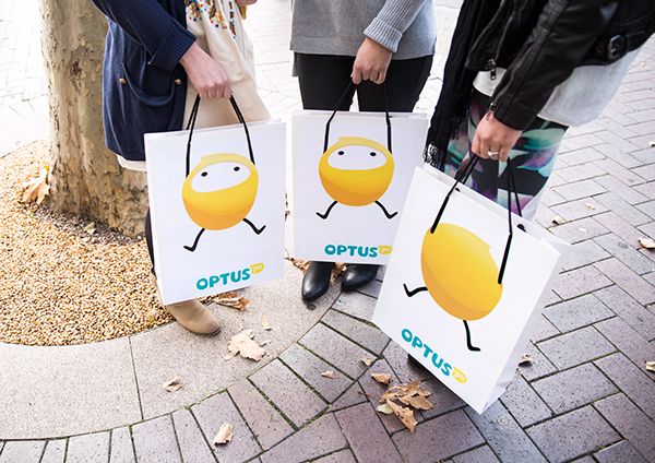
Company: Optus // Designers: Various
Click here to see Optus’s brand guidelines
When your brand identity goes as far as your mascot on shopping bags as your customers walk out the door – I think you’re doing pretty well. Optus is a cellular services provider in Australia, so you may not be familiar with their name or brand. As a result, take this as a great opportunity to explore a new brand without bias.
2. LinkedIn
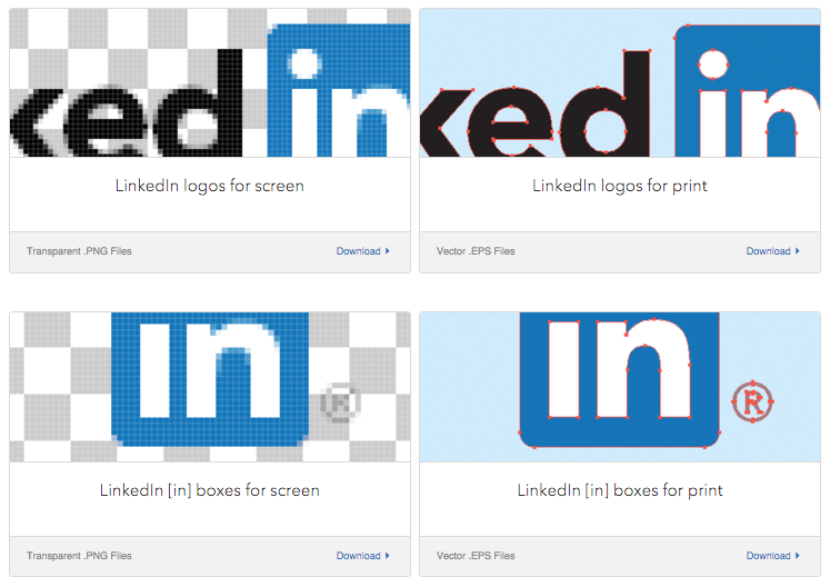
Company: LinkedIn // Designer: LinkedIn – Internal
Click here to see LinkedIn’s brand guidelines
Even though LinkedIn is primarily a website and mobile app, they make sure to cover any print materials. They have one of the cleanest brand guidelines I have come across – full of resources, even downloadable print and web color pallettes to import when designing new collateral.
3. JEGS
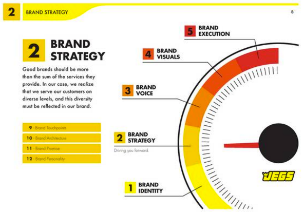
Company: JEGS // Agency: Origo Branding
Click here to see JEGS’ brand guidelines [2]
Even if you’ve never heard of JEGS, you can tell what industry the company is in based on the visual cues they use throughout their brand guidelines. This is a great use of industry concepts to build coherence throughout their brand guidelines.
4. Asana
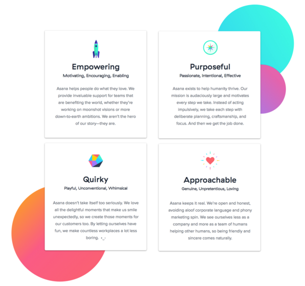
Company: Asana // Designers: Asana – Internal & Moving Brands
Click here to see Asana’s brand guidelines (ZIPs)
It’s one thing to list a bunch of adjectives describing your brand, but it’s better to help everyone understand “Why?” they describe the brand. In this example Asana also goes into the ratio and origin of where the three dots come from (hint: it’s the counter of the “a” in Asana). They even wrote an in-depth Medium article about the process and symmetry of the three dots.
5. *Santa*
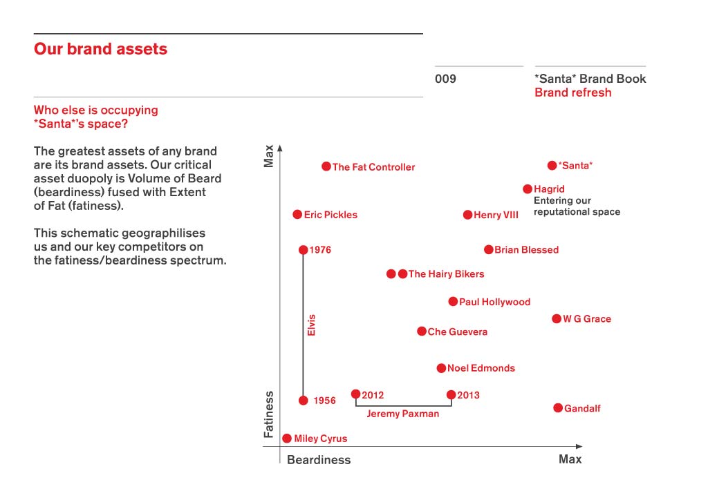
Company: *Santa* // Agency: Quietroom
Click here to see *Santa*’s brand guidelines
Although this is a “concept”, and not an actual brand, Quietroom showed us one important thing with *Santa*: If you’re a fun brand then you should show it – with everything you do. Stay light-hearted, because that’s what you’re known for, not just a big man stuffing himself down your chimney in the middle of the night.
Typographic Brand Guidelines
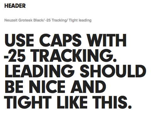
6. Scout
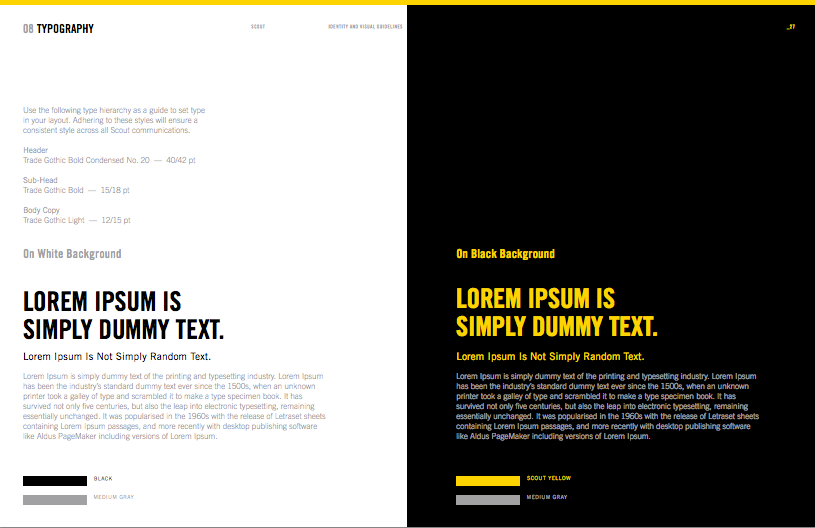
Company: Telenav‘s Scout // Designer: Telenav – Internal
Click here to see Scout’s brand guidelines
Let’s face it, your brand’s text won’t always appear on white backgrounds, so Scout shows us how to prepare for alternate colors. This is a very straightforward example, and honestly, it doesn’t need to be more complicated than this.
7. Truth.
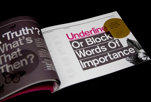
Company: Truth. // Agency: SocioDesign
Click here to see Truth.’s brand guidelines
Truth., as a branding agency, shows just how good they are at what they do. Subtlety may be one of their strengths, but they went purely bold throughout all of their brand guidelines.
8. Macaroni Grill
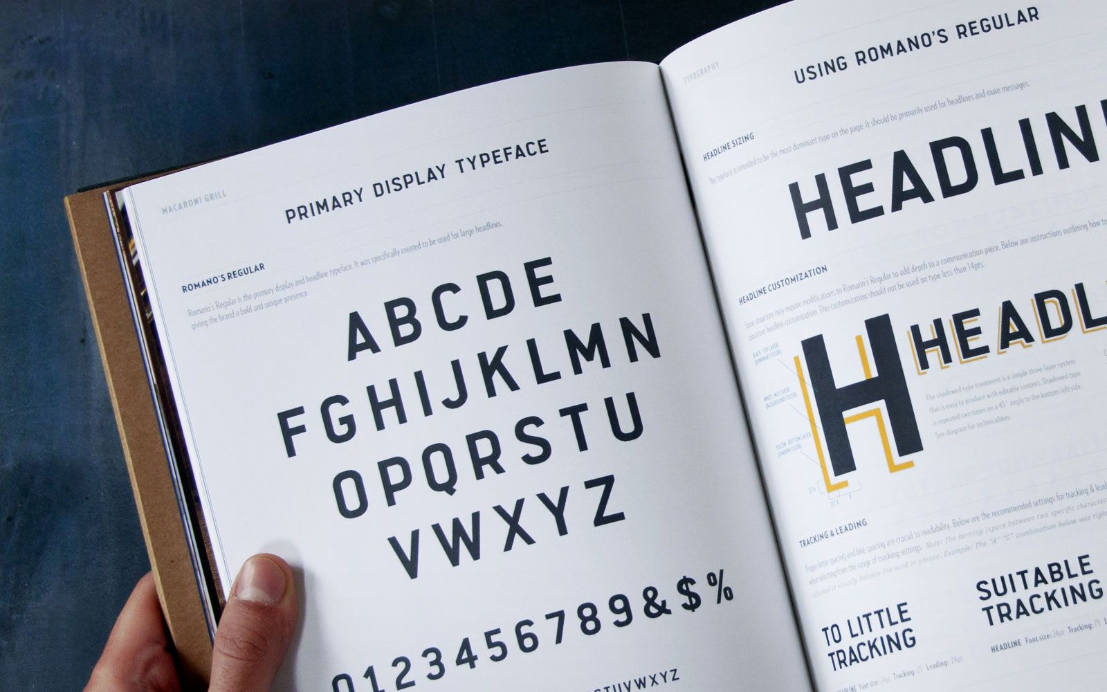
Company: Macaroni Grill // Agency: Superbig Creative
Click here to see Macaroni Grill’s brand guidelines
The way Superbig Creative laid out the brand guidelines reads like a book – it’s beautiful. Creating a custom font isn’t easy, it needs its own style guide, and that’s just what was done for Macaroni Grill.
9. Beats by Dre
Company: Beats by Dre // Agency: R/GA
Click here to see Beats’ brand guidelines
Sometimes it’s better to “hit them over the head” with simple examples.
10. KAE
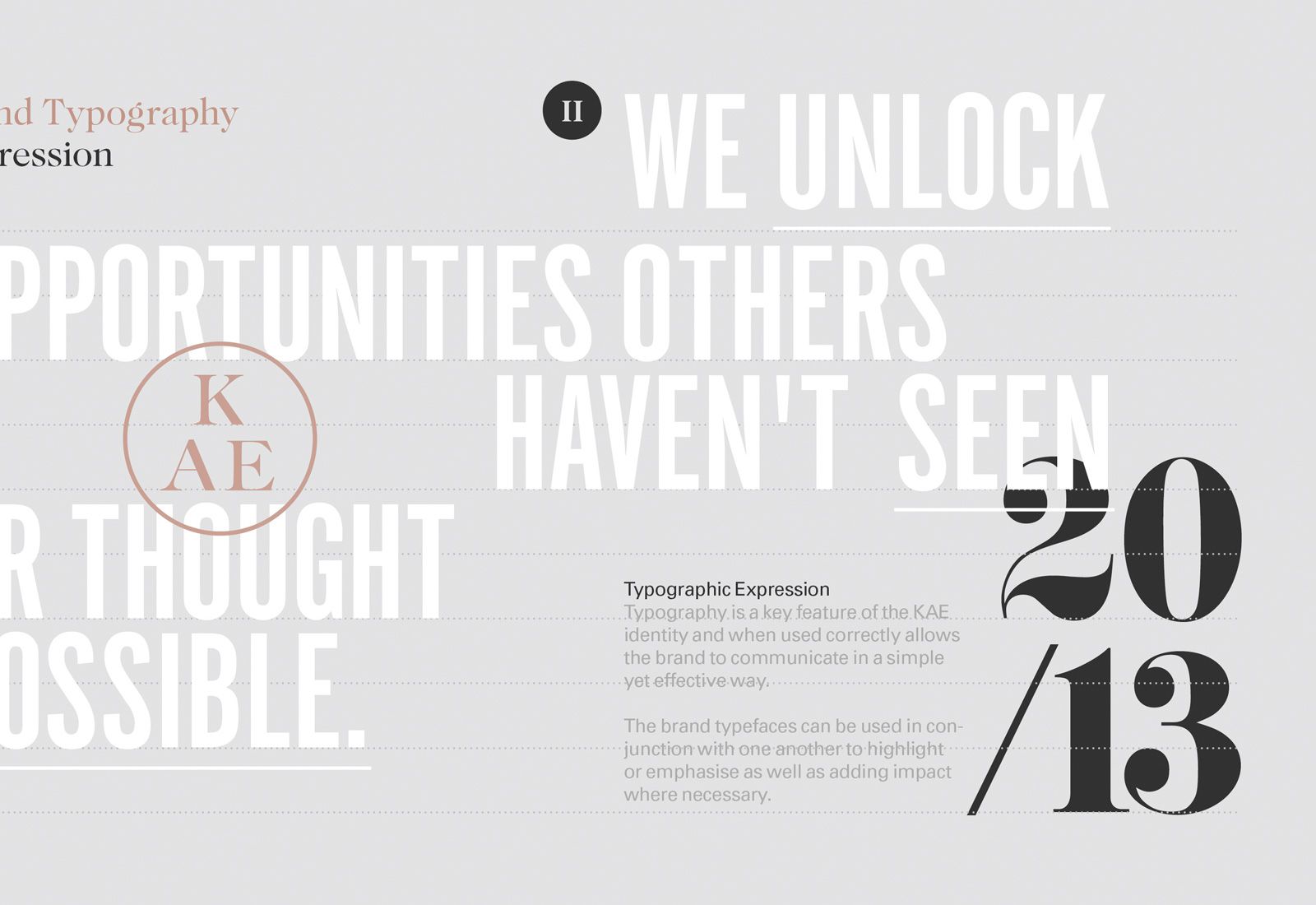
Company: KAE // Agency: SocioDesign
Click here to see KAE’s brand guidelines
There are only 9 pages in the brand guidelines for KAE, so it’s clear that typographic expression is a major identifier for the brand – big enough to take up an entire page. Also of note, SocioDesign did an excellent job creating a rich brand presence through bold serifs and copper colors via web, and foil via print.
Extensive Brand Guidelines
11. ESPN
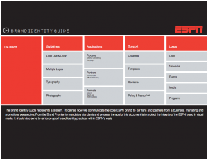
Company: ESPN // Agency: Dalma Design Inc.
Click here to see ESPN’s brand guidelines
At 45 pages long, Dalma Design gave ESPN’s brand guidelines links to each section for easier use. The easier that you can either make things to use or readable, the better it is for your users.
12. Boy Scouts of America
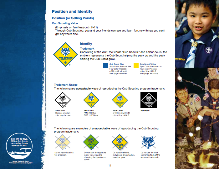
Company: Boy Scouts of America // Designer: BSA – Internal
Click here to see the BSA’s brand guidelines
Because the nature of BSA’s operating platform is based upon small community membership, funding isn’t always a luxury. So, to help parents and leaders maintain the brand integrity it’s important to demonstrate the appropriate usage. Overall, the brand guidelines were jam packed full of information and enjoyable to go through – as some can seem like pulling teeth.
13. Destination Canada
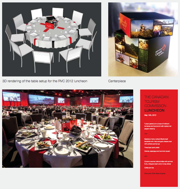
Company: Destination Canada // Agency: DDB Group Canada
Click here to see Destination Canada’s brand guidelines
Table Design? Whoa. 104 pages later, I get it – I officially know how to market Canada.
14. Mohawk
Company: Mohawk Fine Papers // Agency: Pentagram
Click here to see Mohawk’s brand guidelines
Mohawk and their products have become more dynamic, so why not their identity too? Pentagram did an incredible job reflecting their brand through the products. Now that Mohawk Fine Papers has adapted to the digital work with Mohawk Connects, this new brand identity literally pops off of the paper, and the screen – see what I did there?
15. Centric
Company: Centric // Agency: Gretel
Click here to see Centric’s brand guidelines (via Archive.org)
Branding a television channel is an interesting task. Gretel has some beautiful transitions mixed with textures, lines, photos and text in their case study. The use of duotones photos has become a huge trend, courtesy of companies like Spotify. If anything, you can walk away with ideas of how to control the way your UX is designed, and some simple .gifs included in your brand guidelines .pdf is a great solution.
Minimalist Brand Guidelines
16. Uber
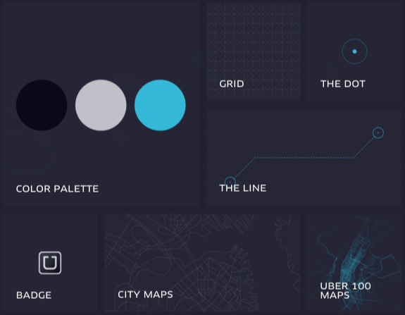
Company: Uber // Designer: Uber Internal
Click here to see Uber’s brand guidelines
The way their branding subdomain is set up allows the user to only see what they need; rather than, having to rifle through a few dozen pages. Also, once the user clicks on the desired portion, those pages are very clean and visually legible.
17.Vanvero
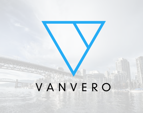
Company: Vanvero // Agency: Brendan Lane
Click here to see Vanvero’s brand guidelines
Brendan Lane trimmed all of the fat, and replaced it with beautiful imagery to reiterate what the brand does – creates digital camera accessories to allow photographers to capture incredible footage. He also laid out all of the necessary examples of logo and wordmark do’s & don’ts; as well as, voice, about, color, typography and more, into just 13 pages.
18. Chempoint

Company: Chempoint // Agency: Hornall Anderson
Click here to see Chempoint’s brand guidelines
Hornall Anderson went with a very simple black, white, and blue branding. Thus, it’s very simple and translates well across all media, so there’s not much hand-holding to do.
19. OntraPort
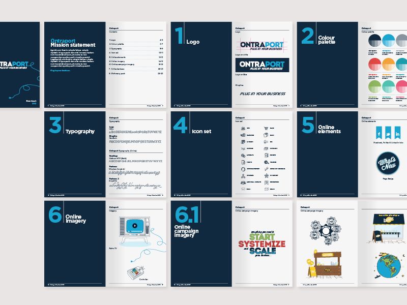
Company: OntraPort.com // Agency: Studio-JQ
Click here to see OntraPort.com’s brand guidelines
The bold use of navy page dividers and large section numbers makes and easy use of referral for the team to use internally. With large examples of company logos, typography, icons, and more, OntraPort definitely set up for success.
20. Red Cross
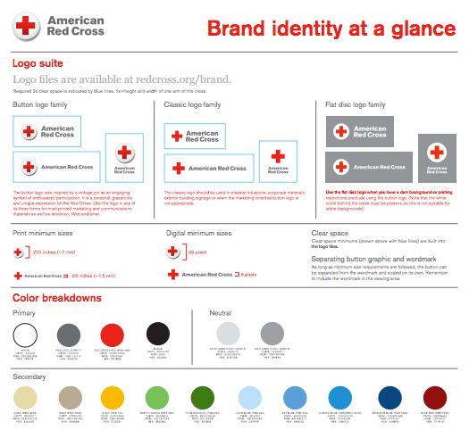
Company: Red Cross // Designer: Red Cross – Internal
Click here to see Red Cross’s brand guidelines poster
A brand “one-sheeter” is an excellent quick, desk-side reference. Even after you’ve made your in-depth brand guidelines, please make a one-sheeter for everyone within your company.
Voice & Tone Guidelines
21. Skype (RIP)
Company: Skype // Designer: Skype – Internal
Click here to see Skype’s brand guidelines (via Archive.org)
Giving great branded examples throughout your brand guidelines really shows “how” everyone should be presenting the brand. You may think that the basic “do’s and don’t” are enough, but they can still be misconstrued and used incorrectly – it just makes a sound brand presence.
22. Amazon
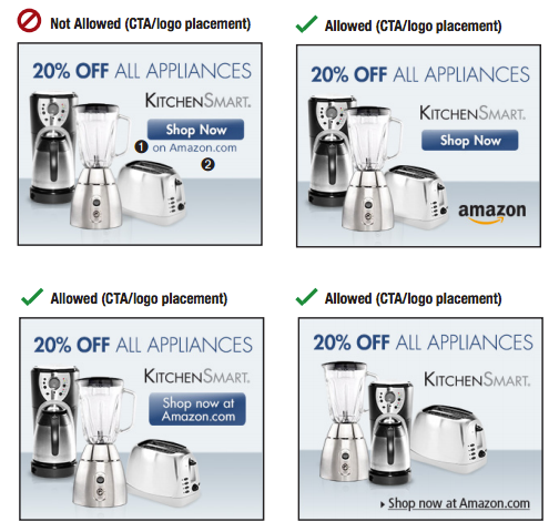
Company: Amazon // Designer: Amazon – Internal
Click here to see Amazon’s brand guidelines
Using the correct voice, even layout, in advertisements is crucial. You need to make sure you’re saying “the right thing.” Using a CTA depends on the product and where you’re advertising, and Amazon went as far as giving examples of both on-site and off-site ads in the brand guidelines.
23. Fandango
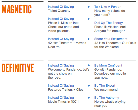
Company: Fandango // Agency: Gelcomm
Click here to see Fandango’s brand guidelines
Break it down. Fandango has 4 main branded words their using, and next to each word the present get examples of just what they mean, and how to use them. This is a great example of speaking to those reading your brand guidelines like a human. Kudos.
24. DFW Airport
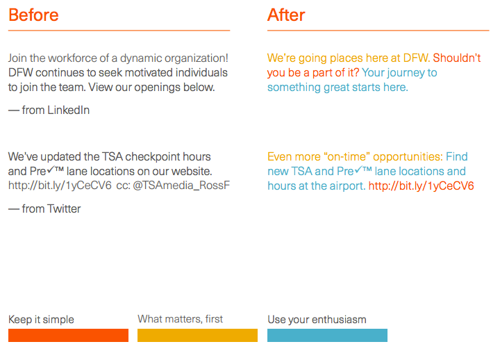
Company: DFW Airport // Agency: Interbrand
Click here to see DFW’s brand guidelines (via Archive.org)
I was traveling through DFW Airport when the new branding launched. So, I can’t help but feel like I had something to do with it – but, in reality, when I read the article about the new branding I had to give them a nod. They clearly went through and extensive process to lay their ground rules: so much so, that they color-coded their voice guidelines. That’s a technique I hadn’t seen before. Who knew color-coding could be innovative?
25. IT Job Board (now Dice)
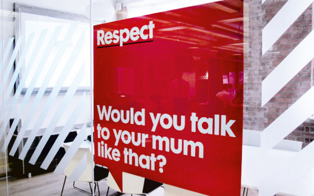
Company: IT Job Board (now Dice) // Agency: Ragged Edge
Click here to see IT Job Board’s brand guidelines
Taking the step to further promote your brand voice with reminders around the office is a great cue to take from IT Job Board (now known as Dice).
26. MailChimp – Voice & Tone Guide
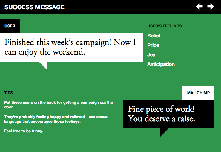
Company: MailChimp // Designer: MailChimp – Internal
Click here to see MailChimp’s voice & tone brand guidelines
MailChimp is a great SaaS email platform that makes email marketing way easier (it’s our go-to tool). So, it only makes sense that their voice and tone would be supportive and uplifting. There’s nothing like getting a big ol’ slap on the back from your software.
Grid-Based Brand Guidelines
27. 1968 Mexico City Olympics
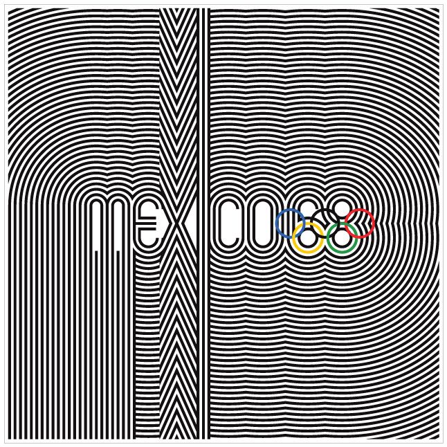
Company: 1968 Mexico City Olympics // Designer: Lance Wyman
Click here to see the 1968 Mexico City Olympics brand guidelines
You cannot create and identity like this without a grid. Although this event may be known for something else, this branding identity won’t soon be forgotten, because of the bold brand identity of the Olympics. It’s remarkable how the design team was able to transfer the heavy line design throughout the Olympics, from the stadium design to apparel design.
28. Demand Media
Company: Demand Media // Agency: Manual Creative
Click here to see Demand Media’s brand guidelines
Manual Creative found a great way to repurpose Demand Media’s logo to break up their print and web formatting. Rather than shrinking and dissecting their logo, they blew it up to create unique negative space that would be hard to conceive otherwise.
29. Gandour

Company: Gandour // Agency: SocioDesign
Click here to see Gandour’s brand guidelines
Now this grid is a bit extensive, but you can see why the designer went as far as they did for the sake of symmetry. Upon further review of their website, I don’t see this particular logo being use, nor the grid – but it would be incredible to see what they could come up with from the grid.
30. TBS
Company: TBS // Agency: Sean Heisler
Click here to see TBS’s brand guidelines
Oh, the simplicity. Thank you – thank you. If you click on Sean’s link, you will see the versatility of the logo through the images and colors he applies. Sort of a has a mid-80’s MTV feel, fast-forward to today.
31. District Circle
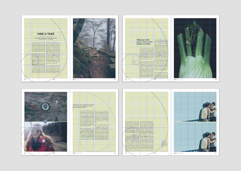
Company: District Circle // Agency: BASIC
Click here to see District Circle’s brand guidelines
The Golden Ratio, and copy guidelines – BASIC built a great unit of measurement for District Circle to follow. Including the Golden Ratio is something I wouldn’t have thought about, but it’s clear (especially in the lower left layout) how much of a difference it can make.
Inspirational Brand Guidelines
32. Inter Miami FC
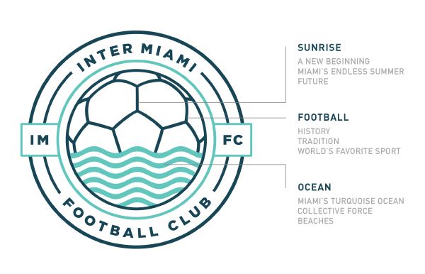
Company: Proposed Inter Miami FC // Designer: Diego Guevara
Click here to see the Conceptual Inter Miami FC’s brand guidelines (via Archive.org)
This a fictional brand, created by a fan in hopes of a new MLS soccer team coming to Miami. He went through a very thorough branding process just to show how well the city of Miami could be represented by a new addition. These brand guidelines really get the point across by explaining the meaning behind every shape and line – that’s a step often overlooked in many brand guidelines.
33. Kansas State University
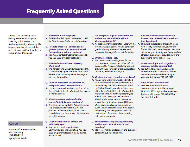
Company: Kansas State University // Designer: K-State – Internal
Click here to see Kansas State University’s brand guidelines
You may think you have hit all of the nails on the head, but remember how many swings it took to do so. People will have questions, they always do. One way to speak to that is to include a great Q&A at the end with internal contact information.
34. Calgary Chamber of Commerce
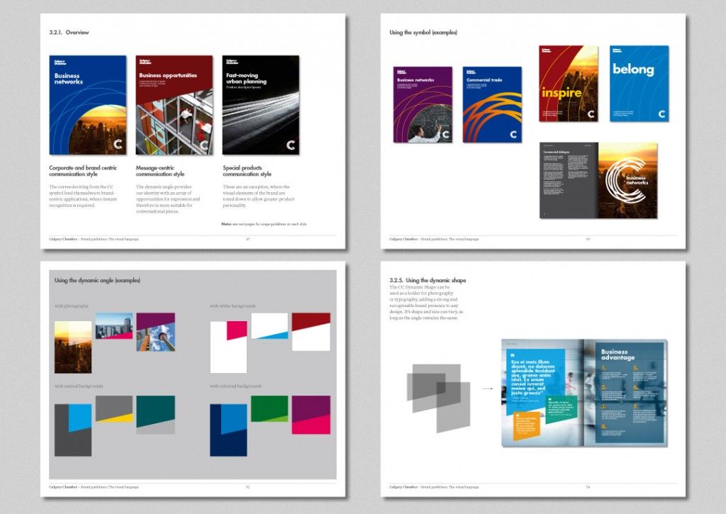
Company: Calgary Chamber of Commerce // Artist: Iancu Barbarasa
Click here to see the Calgary Chamber of Commerce’s brand guidelines
Using branded elements to carry throughout all of your brand collateral reiterates brand stability. These are very forward-thinking, financial-based brand guidelines that many conservative companies can use as a jumping-off-point.
35. University of Dayton
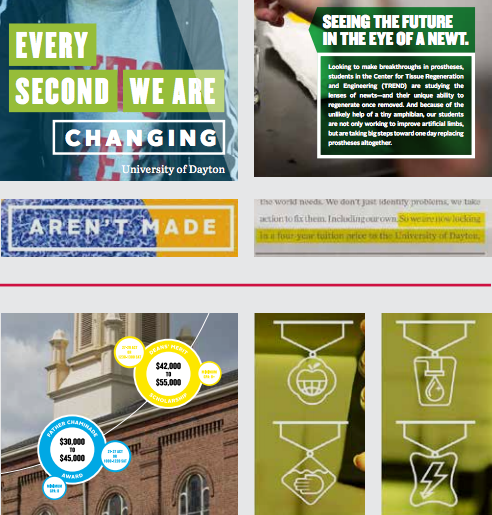
Company: University of Dayton // Designer: University of Dayton – Internal
Click here to see University of Dayton’s brand guidelines
Even though the University of Dayton has incredibly conservative brand standards, they managed to find a coherent way to market themselves in a way that is relatable to their market: all while maintaining their brand integrity. By the way, their institutional brand guidelines are 46 pages long, and it doesn’t even include their athletic marks – impressive.
36. Jones Soda Co.
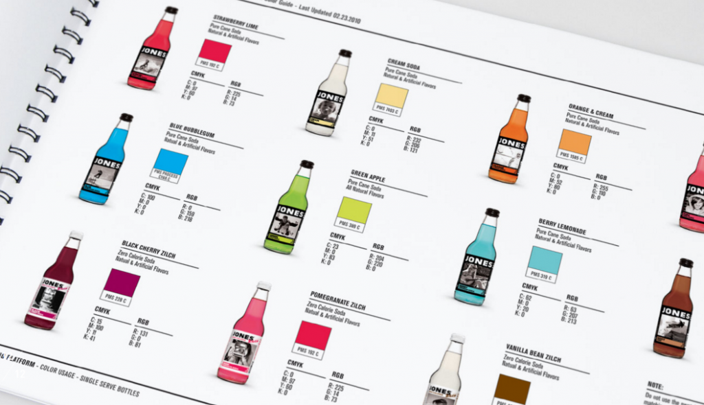
Company: Jones Soda Co. // Agency: Superbig Creative
Click here to see Jones Soda Co’s brand guidelines
Identifying your products as specific brand colors is another great cohesive branding style. In Jones Soda’s case, they are using this as a guide to show the three primary color IDs (Pantone, CMYK, and RGB) to help maintain the branding across all of their brand mediums. Companies often separate their products from their brand guidelines, but Superbig Creative found a seamless way to combine everything into one.
My goal with this article was to show you a collection of some brands that are doing it right.
These are just a few of the many brand guidelines that I found interesting available on the internet. Please feel free to follow the links I have provided to the either the companies or agencies to see some other amazing projects.
If you’re just getting started with your brand guidelines, take a look at my last article, How To Produce Your First Brand Style Guide. When you’re ready to expand beyond that, Graham “Logo” Smith provides us with a free 14-Page Brand Identity Guidelines Template to get you started. Just add a few pages to talk about your voice, show some examples of brand usage, and add a Q&A at the end.
Do you know of a great brand guidelines document out there that we missed? Maybe one that you worked on?
Leave a note in the comments for others to check it out!
✉️ Get an email when we publish new content:
Don't worry, we won't bug you with junk. Just great content marketing resources.

Ready To Try
Content Harmony?
Get your first 10 briefs for just $10
No trial limits or auto renewals. Just upgrade when you're ready.
You Might Also Like:
- How To Produce Great Conference Coverage
- 5 Skills Brands Need To Learn From Publishers
- Email Split Testing Ideas
- How To Optimize eCommerce Product Pages
- How To Optimize eCommerce Category Pages
- This Is What Great Content Looks Like
- Content Success Factors for SEO
- Keyword Research for the Complete Customer Lifecycle
- 8 Reasons Journalists Make The Best Content Marketing Writers
- The Hourglass Sales Funnel
- eCommerce Blog Examples That Can Actually Generate Sales
- What Is A Content Brief (And Why Is It Important)?
- How To Update & Refresh Old Website Content (And Why)
- How to Create a Content Marketing Strategy [+ Free Template]
- How To Create Content Marketing Proposals That Land The Best Clients
- How To Write SEO-Focused Content Briefs
- How To Create A Dynamite Editorial Calendar [+ Free Spreadsheet Template]
- The Keyword Difficulty Myth
- 12 Content Marketing KPIs Worth Tracking (And 3 That Aren't)
- How To Do A Content Marketing Quick Wins Analysis